In an earlier post about computing example mobile metrics using SQL, we used SQL queries to obtain metrics about installs and revenue for a mobile game.
In this post, we will use Tableau to compute the same metrics and more, as well as graph the results.
Background
In our earlier SQL post, we referred to two data sets stored as comma-separated text files. Links to the files can be found in that post.
- app_installs.csv – The rows of this file represent installation events. There are fields player_id and time. There are additional fields for the OS of the device used and the country, but we will not refer to these.
- item_purchases.csv – The rows of this file represent in-app purchase events. There are fields player_id, time, and purchase_cost. There is also a field for the type of item purchased, but we will not make use of it.
In the rest of this post, we will use Tableau to manage this data.
Set-up in Tableau
The two .csv files should be loaded in Tableau as two distinct data sources. They do not need to be joined. We will make use of Tableau’s data blending to relate information between the two sources when needed.
So, we assume that there are two data sources loaded: app_installs and item_purchases.
For each of the sections below, we’ll briefly describe how to compute each metric in Tableau.
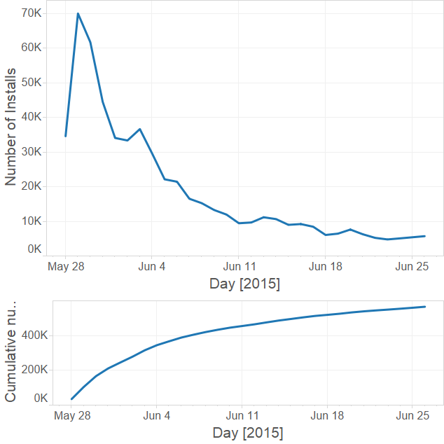
Number of installs
First, we’ll compute the number of installations for each day. This only requires information from the app_installs data source.
Columns
We want the graph to have time represented on the horizontal axis. So, we first drop the app_installs Time dimension onto the Columns shelf. By default, Tableau selects YEAR(Time) for the resulting pill. Since the data only lasts about a month, we should change this to a DAY option. We could do this by drilling down using the + icon on the pill, until we get to the day level. Instead, we will use the pill’s menu to select the Day option.
Be careful to select the Day option that still respects month and year. What we are interested in is equivalent to the following expression (which could also be manually added to the Columns shelf):
We don’t want to use the formula “DAY(Time)” on it’s own for our current purposes. This formula returns only the number of the day (example: 28 when given May 28, 2015), and so could combine days across different months or plot things out of the expected order (example: info for June 27, then info for May 28). Somewhat confusingly, Tableau will display “DAY(Time)” as the name of the pill in the Columns shelf when we use the pill’s menu to select either option.
Rows
We will count the number of installations by counting distinct player IDs for each day. We want to count distinct player IDs because this makes sense for our particular data set, where a repeated player ID means that the same person has installed the app two or more times.
If we don’t care about checking for unique player IDs, we can just drag the generated Number of Records measure to the Column shelf.
If we do care about checking for unique player IDs, we can create a calculated field either by right-clicking in the white space of the Data window, or by using the Analysis drop-down in the top menu. We can call the field “distinct players” and use the following formula to count the distinct player IDs.
We add this new field to the Rows shelf, and we’re done.
This should show the graph roughly as expected. From here, we can play with formats and edit the axes to make the graph look nicer. Below, I’ve also added a Time filter to remove the information from the last day, which was not a complete day’s worth of data. I’ll include a picture of this graph at the end of the next section.
Cumulative number of installs
Now, we’d like a cumulative sum (also called “running sum” or “running total”) of the above data. That is, we want a graph where the values represent the number of installations up to and including that day.
Doing this now just takes a few mouse clicks. First, we duplicate the sheet we just made for the number of installs graph. Now, on the new sheet, we use the distinct players pill’s menu to select Quick Table Calculation and then Running Total.
Here’s a picture containing the last two graphs.
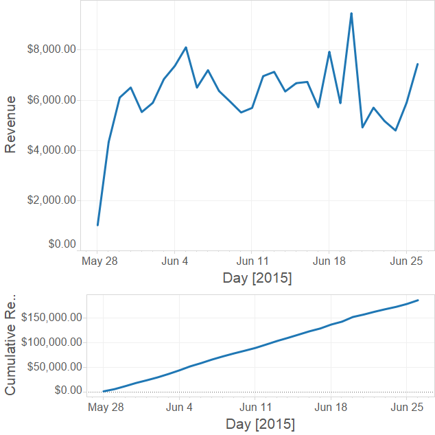
Revenue
Next, we will compute the revenue for each day on a new sheet. This will only require the item_purchases data source.
Columns
Like above, we want the horizontal axis broken down by day. So we just repeat the steps above. In this case, we should use the Time dimension from the item_purchases source when carrying out the steps, but it doesn’t actually matter because Tableau’s data blending would correctly link the times.
Rows
Since the data available to us in the item_purchases source only contains purchase events and the cost of each purchase, we will need to sum the costs to compute revenue. We drag the Item Cost measure to the Rows shelf, and Tableau sets it to a SUM automatically.
That’s it. We’ll include the graph at the end of the next section.
Cumulative Revenue
We can easily get the cumulative revenue in the same way that we got cumulative installs from installs. Just duplicate the Revenue sheet, and on the new sheet, use the Item Cost pill’s menu to add a Quick Table Calculation for Running Total.
Here’s a picture of the last two graphs.
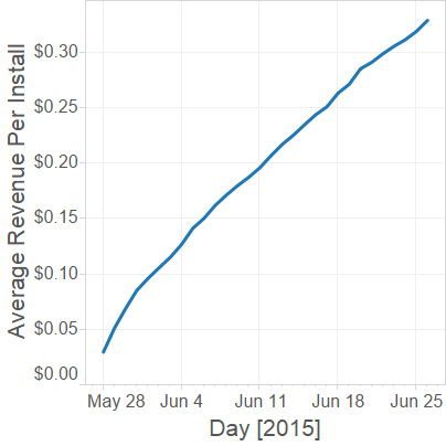
Average Revenue per User
Like in our earlier blog post, we will compute a version of Average Revenue per User (ARPU) using the above cumulative metrics. This is really an average revenue per installing user. This is the first metric we’ll compute that requires both data sources at once. We’ll use a new sheet again.
Columns
Again, we want the horizontal axis broken down by day, so we will use the steps from above. However, this time it is important that we use the Time dimension from the app_installs data source, and that we place this Time on the Column shelf before adding anything to the rows. This ensures that app_installs is considered the primary data source for the sheet.
Rows
We create a new calculated field called ARPU. The formula we will use is the following.
This is the ratio of the two cumulative metrics we’ve computed already: cumulative revenue divided by cumulative installs. Because app_installs is the primary data source, the Item Cost field has to be specified as coming from the item_purchases source.
We add the ARPU field to the Rows shelf, and we’re done.
Here’s our graph.
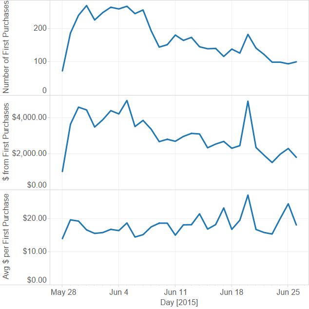
First purchase info
Now, we’ll start discussing some metrics that we did not cover in the earlier blog post.
On a new sheet, we will compute the number of first purchases each day, the revenue from new purchases each day, and the average revenue per first purchase each day.
These will only require the item_purchases data source.
Number of first purchases
Columns
As before, we want to break the horizontal axis down by day.
Rows
First, we will create a new calculated field called “Number of Purchasing Players”. The formula for this field is the following.
This field just computes the number of players we saw make a purchase. This is needed because the item_purchases source has entries for each purchase event, so players may be repeated.
Drag this field to the Rows shelf.
Currently, the graph shows the total number of purchasing players each day. But, we just want to see the number of “first purchases” or “new purchasing players”. To explain: a player might make purchases on several different days. Currently, we are counting a player on Day N if they make any purchase on Day N, even if they have already made a purchase on Day N – 3, for example. But, we only want to count a player on Day N if that player’s first purchase occurred on Day N.
To restrict the data to just the first purchases, we can create a new calculated field and add it as a filter.
We make a new calculated field called “Current day is first purchase”, and use the following formula.
This is a boolean valued formula that uses one of Tableau’s level-of-detail (LOD) expressions. The formula compares the minimum date that appears for a player against the date we are considering in the graph.
We drag this new field to Filters and choose to only show values which yield True.
Our graph now counts only those players who made their first purchase on the given day. We will include graphs here once we set up 2 more graphs on this sheet.
Revenue from first purchases
On the same sheet, we can drag Item Cost to the Rows shelf. Tableau should automatically take the SUM of this field. This gives us a graph of revenue for each day, but because of our filter, this is just the revenue from first purchasing users on that day.
Note the subtle distinction here: this is not the average revenue per first purchase, but the average revenue per first purchasing user on the day of their first purchase. If a player made several distinct purchases on their first purchase date, these multiple purchases will be added into our sum. Notice that this might not make sense for users in time zones differing from ours (their “day” is sometimes different from our “day”).
We will include the graph at the end of the next section.
Average revenue per first purchaser
On the same sheet, we will add a graph that shows the ratio of the last two values. This represents, for each day, the average revenue obtained on that day from players making their first purchases on that day.
We can create a new calculated field whose formula is the following, and add it to the Rows shelf.
Here are the last 3 graphs we’ve created.
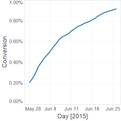
Conversion
Finally, we will compute the conversion percentage. For us, this will be the percentage of installing users who eventually make a purchase. We will define this to be the ratio between the running total of first purchases and the running total of installations.
We’ll use a new sheet.
Columns
We add days to the Columns shelf as before. We should use the item_purchases data source so that our filter will apply correctly.
Rows
We create a new calculated field called Conversion. The formula we will use is below.
This divides the running total of first-purchasing players by the running total of installed players.
Filters
Drag the “Current day is first purchase” dimension to Filters, and choose to only show True.
Here’s our graph.
Summary
We used Tableau to compute the metrics we discussed in our earlier post about computing example mobile metrics using SQL. We started with two .csv files, computed a variety of metrics and graphs as we went. We saw how to use calculated fields and filters, and how to compare fields from two data sources using Tableau.